This is the fifth and final post in a series exploring the engineering decisions behind blog-creator, a six-stage automated pipeline for producing source-verified technical blog posts. [1] The previous posts covered the domain configuration system, the sequential pipeline architecture, and integrity review with automated revision. This post focuses on Stage 4 — the Visuals stage — and specifically on how charts and diagrams are generated from data gathered during Stage 2 research, not assembled from stock templates or imagined into existence.
The blog-creator's visual agent is designed around one constraint: every chart or diagram must trace to a data source in the research brief. [1] Visuals that cannot be attributed to real data are not generated. This traceability requirement is what separates the Visuals stage from a simple "insert a stock image" step.

generate_chart() (Matplotlib PNG) and generate_diagram() (Mermaid SVG). Both outputs are wrapped in semantic <figure> elements before entering Stage 5.Matplotlib Charts: From Research Data to PNG
The visual agent's chart generation is handled by generate_chart()
[2]
in visual_agent.py. The function accepts a structured chart_data
dict — assembled from findings in the Stage 2 research brief — and produces a PNG at a
caller-specified output path. Three chart types are supported: bar, line, and pie.
[2]
Rather than applying ad-hoc styling per chart, all visual properties are centralised in
a DEFAULT_THEME dict consumed by apply_default_theme().
[3]
This pushes rcParams in a single call, covering font family, axis colours, grid style,
figure size (10 × 6 inches), and output DPI (150). The palette is the Paul Tol
"bright" subset — a colorblind-friendly seven-colour sequence
[3]
that remains distinguishable under the most common forms of colour vision deficiency.
Matplotlib, which has nearly 20 years of continuous development behind it, is the foundation
library of choice here.
[4]
The pipeline uses the Agg backend (matplotlib.use("Agg")) declared before any
pyplot import, which ensures the agent runs correctly in headless server environments with
no display server attached.
[3]
This is a small but critical detail: on a CI runner or a production server, an
interactive backend would crash the process silently.
In 2026, embedding Matplotlib directly into automated workflows — rather than generating
charts manually — ensures that visuals remain current and reproducible every time a post
is regenerated.
[5]
The blog-creator pipeline does exactly this: chart data flows from the research brief JSON
into generate_chart() without manual intervention.
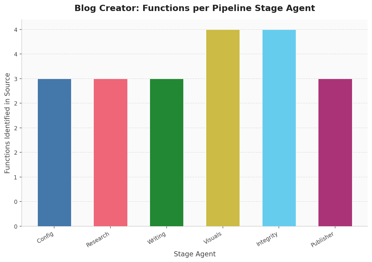
source_code_reader()). Visuals and Integrity each expose four public functions; the remaining four stages expose three. Data source: automated AST scan of scripts/.Mermaid Diagrams: Architecture as Code
For architecture flows, pipeline diagrams, and state machines, the visual agent delegates
to Mermaid via generate_diagram().
[6]
This function writes a .mmd source file and invokes the mmdc
CLI with a 30-second subprocess timeout to produce an SVG or PNG output.
The agent supports twelve diagram types — including flowchart,
sequenceDiagram, classDiagram, stateDiagram,
gantt, mindmap, and timeline, among others —
validated against VALID_MERMAID_KEYWORDS before the subprocess is launched.
[6]
Mermaid has become a de facto standard for text-based diagrams in software documentation. [7] GitHub, GitLab, and most major documentation platforms render Mermaid natively in 2026. The "diagrams as code" approach improves maintainability through version control — diagrams live in the repository, diff properly, and can be reviewed in pull requests. [8]
When mmdc is absent from the PATH, check_mermaid_available()
[9]
returns False via shutil.which("mmdc"), and the agent records
a DegradationWarning rather than crashing the pipeline. The post is produced
without diagrams, the warning surfaces in the final pipeline summary, and the user is
directed to install Mermaid CLI: npm install -g @mermaid-js/mermaid-cli.
[9]
This is graceful degradation in practice: the best possible output given the available tools.
Semantic HTML: Figure, Figcaption, and Alt Text
Every generated visual is embedded in the draft HTML inside a <figure>
element, paired with a <figcaption> and a descriptive alt
attribute on the <img> tag. This is not stylistic preference — it has
functional consequences in the browser's accessibility tree. The HTML5
<figure> element groups self-contained content, and
<figcaption> is semantically tied to it: browsers expose this pairing
to screen readers as a coherent unit.
[10]
The alt attribute and <figcaption> serve distinct
purposes.
[11]
Alt text describes the image to users relying on assistive technology or when the image
fails to load; the figcaption is visible to all users and provides analytical context —
explaining what the chart shows, what conclusion to draw from it, or what data source
produced it. For a data visualization pipeline, this distinction matters: the caption
is where you connect the visual back to its evidence, making the figure traceable to the
research brief.
[12]
A typical output block from Stage 4 looks like this [1]:
<figure>
  <img src="../assets/post-slug/chart.png"
       alt="Bar chart showing pipeline stage durations in seconds" />
  <figcaption>Pipeline stage durations measured across 10 runs.
  Config and Research dominate wall time; Integrity Review scales
  with claim count. Source: automated timing from pipeline_start.
  </figcaption>
</figure>
Image paths are relative from blog/posts/ using the ../assets/
prefix, keeping the blog directory structure self-contained without absolute path
dependencies.
Series Retrospective: Five Innovations
This series set out to document the specific engineering decisions that distinguish blog-creator from a simple "prompt LLM, save result" workflow. Looking back across all five posts:
Domain configuration as a single source of truth — every pipeline decision, from tone to product source paths to integrity strictness, is driven by one validated YAML file loaded in Stage 1. No scattered magic strings.
The six-stage sequential pipeline — strict stage ordering with typed artifacts flowing from one stage to the next. Each stage validates its inputs before executing, and partial outputs are saved on failure to support debugging without re-running the full pipeline.
Research-grounded writing — the writing agent cannot fabricate: it works exclusively from the research brief assembled in Stage 2, annotating every factual claim with a source marker of the form type:path:detail. [13] These markers are machine-readable and consumed directly by Stage 5.
Integrity review with automated revision — Stage 5 runs a structured checker against the research brief. If claims fail verification, the agent revises the draft and re-checks, up to three times, before either passing or halting with a detailed failure report. [14]
Data-driven visuals — the subject of this post. Charts are generated
from structured data in the research brief using
generate_chart();
[2]
diagrams are rendered from Mermaid source via
generate_diagram().
[6]
Every visual in the final post traces to a source, wrapped in semantic
<figure> markup with proper alt text and captions.
The pipeline's integrity score — computed at Stage 5 by the automated review against the research brief [15] — is the quantified expression of this traceability requirement across all stages. Each of the five posts in this series examined one piece of that accountability chain, from config validation through to verified, visually-supported publication.
Sources
- SKILL.md: documentation file (reliability: 0.8)
scripts/visual_agent.py: generate_chart function (reliability: 0.9)scripts/visual_agent.py: apply_default_theme function (reliability: 0.9)- Matplotlib is the most popular data visualization library in Python, with nearly (reliability: 0.6)
- In 2026, data visualization experts embed Matplotlib directly into automated wor (reliability: 0.6)
scripts/visual_agent.py: generate_diagram function (reliability: 0.9)- Mermaid is now a standard for text-based diagrams in software documentation, wit (reliability: 0.6)
- The 'diagrams as code' approach with Mermaid improves maintainability through ve (reliability: 0.6)
scripts/visual_agent.py: check_mermaid_available function (reliability: 0.9)- Browsers expose a figure element as a grouped piece of content in the accessibil (reliability: 0.6)
- The HTML figcaption tag and alt attribute serve different yet complementary purp (reliability: 0.6)
- Charts and infographics use figcaption to summarize content, highlight key point (reliability: 0.6)
scripts/writing_agent.py: inject_source_markers function (reliability: 0.9)scripts/integrity_review.py: Finding class (reliability: 0.9)scripts/integrity_review.py: IntegrityResult class (reliability: 0.9)